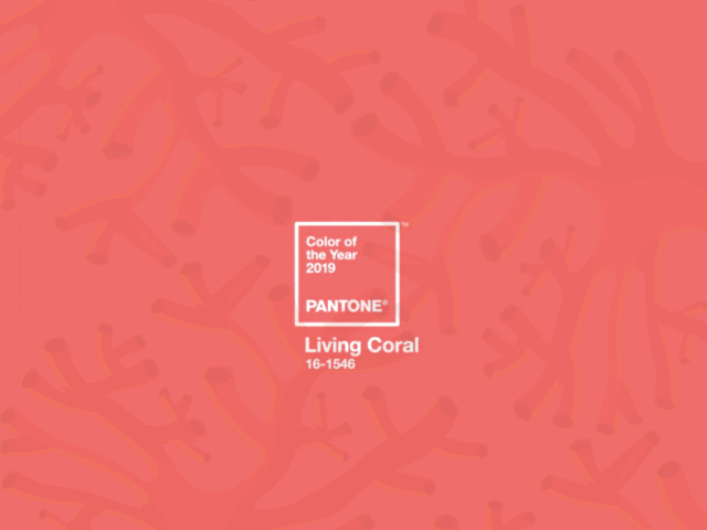
Year after year, the colour experts at Pantone carefully select a Colour of the Year, taking inspiration from all around the world, seeking out new colour influences from popular culture; entertainment, art, fashion, popular travel destinations; as well as new technologies, materials and effects. For the last twenty years, they have unveiled their choice every year and led the way for designers in all kinds of industries, from home decor to fashion; from industrial design to packaging and graphic design.
Living Coral: 2019 Colour of the Year
This year’s choice for Colour of the Year has been revealed as (16-1546), Living Coral; a vibrant yet relaxed pink to comfort and revitalise in this fast-paced action-packed world we live in. This is a change from last year’s Ultra Violet, which was a bold and dramatic shade of thought-provoking deep purple, meant to push us forward into the future. Interestingly enough, wallpaper aficionados Graham and Brown made the choice to go with a pink tone for their Colour of the Year 2018; a dusky shade titled “Penelope” which beautifully accented their wallpaper print of the year.

Image Credit: Pantone
Living Coral represents the fusion of modern life, as a colour that appears in nature as well as being prevalent on social media, making this a familiar and nurturing shade. With digital distractions becoming more insistent, Pantone have selected this colour to remind us of the simple, immersive reality of nature and our own playful and joyful natures.
To go alongside this choice, Pantone have also released a selection of palettes containing complementary colours to be used in conjunction with Living Coral.
Pantone’s 2019 Colour Palettes
Focal Point
This is a palette of calm and muted shades such as Forest Biome, Twill, Martini Olive and Storm Gray; in this selection, Living Coral stands out like a beacon and becomes the focal point of the colour scheme, brightening up and giving life to the rest.
Shimmering Sunset
As indicated by the name given to this palette, it consists of complementary pink shades such as Aurora Pink and Conch Shell, with some orange and peach tones like Amberglow and Papaya present too, giving the stunning impression of a colour-splashed sunset sky.
Sympatico
This palette is made up of a range of humanising internationally-inspired skin tones and rosy pinks; fusing together Burnt Henna, Candlelight Peach and Mellow Buff with Living Coral as well as Sun Kissed Coral.
Trippy
Why not get high with this selection of hallucinogenic hues? “Trippy” matches Living Coral with some correspondingly bright and energetic colours, such as Pink Lemonade, Sulphur Spring and Vivacious; there’s not a muted shade in the house when it comes to this combination, so it’s not for the faint hearted, but some fantastic and sophisticated results can be achieved nonetheless.
Under the Sea
The final palette suggested by Pantone follows the marine theme of the Colour of the Year; “Under the Sea” is another bright and vivid selection of shades, bringing to mind the watery splendour one might find beneath a tropical paradise island. Living Coral, Sea Pink and the rich Vibrant Yellow are beautifully complemented by various blue and green tones such as Limpet Shell (a bright and beautiful twist on duckegg blue) Turkish Sea and Viridian Blue.
So if you’re thinking of freshening up your decor this year, what are you waiting for? Pick your favourite selection from the palettes and turn your home into an underwater palace! If you need more space in your home to implement all of your home decor ideas, consider a loft conversion or extension; turn that useless loft space or garage into a room you’ll love. Contact the experts at MPK Lofts, who can help you with every step of the process.


